In a bid to continuously refine our Webflow expertise and push the boundaries of web design, Quo Agency embarked on an ambitious project: recreating several iconic Apple product pages. This endeavor served as a valuable learning experience, allowing us to delve into Apple's design philosophy, master complex Webflow interactions, and gain insights into creating immersive, engaging web experiences.
Project Scope
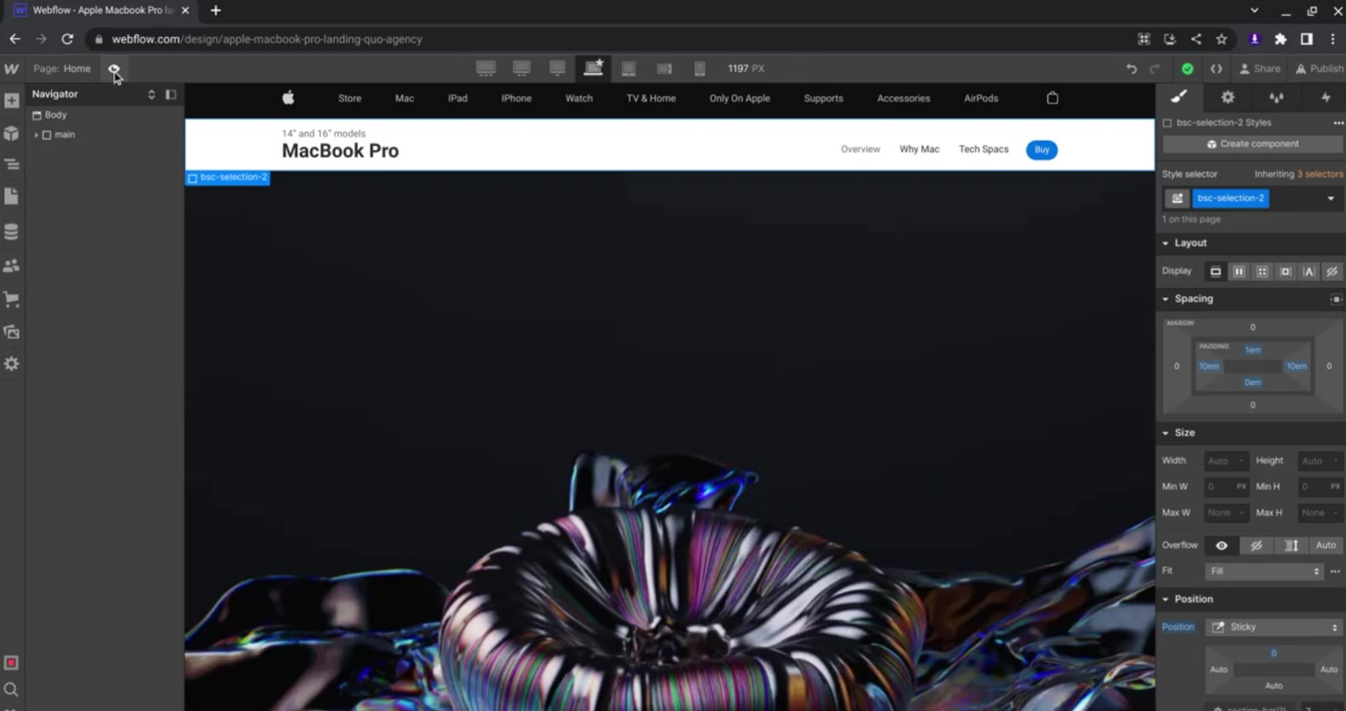
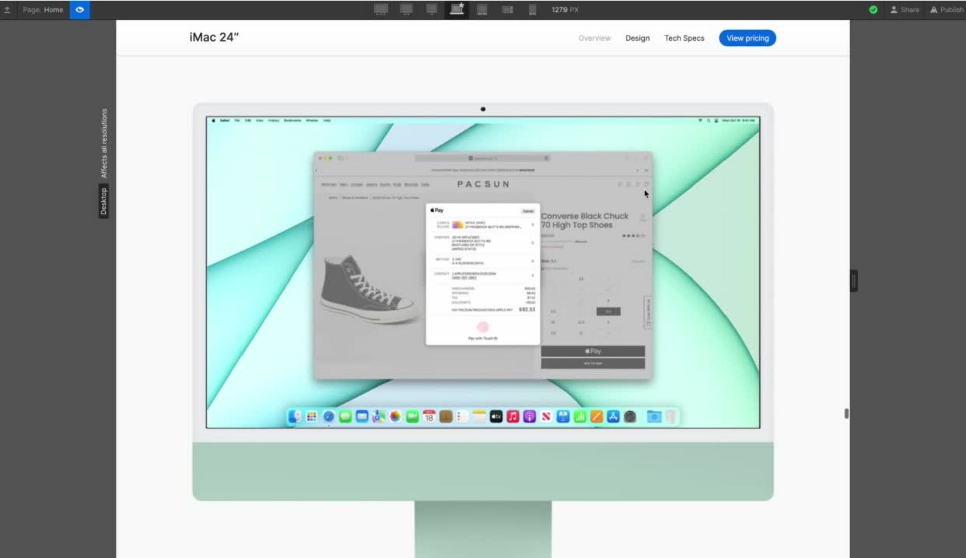
We meticulously rebuilt pages for the MacBook Pro, Mac Mini, Mac Pro, MacBook Air, Pro XDR Display, and iMac, focusing on replicating not just the visual aesthetics but also the underlying interactions and user experience.
We gained a deeper understanding of Apple's storytelling prowess, observing how they seamlessly integrate product features with benefits, leverage visuals to support the narrative, and create a sense of discovery for the user.
Dynamic On-Scroll Interactions
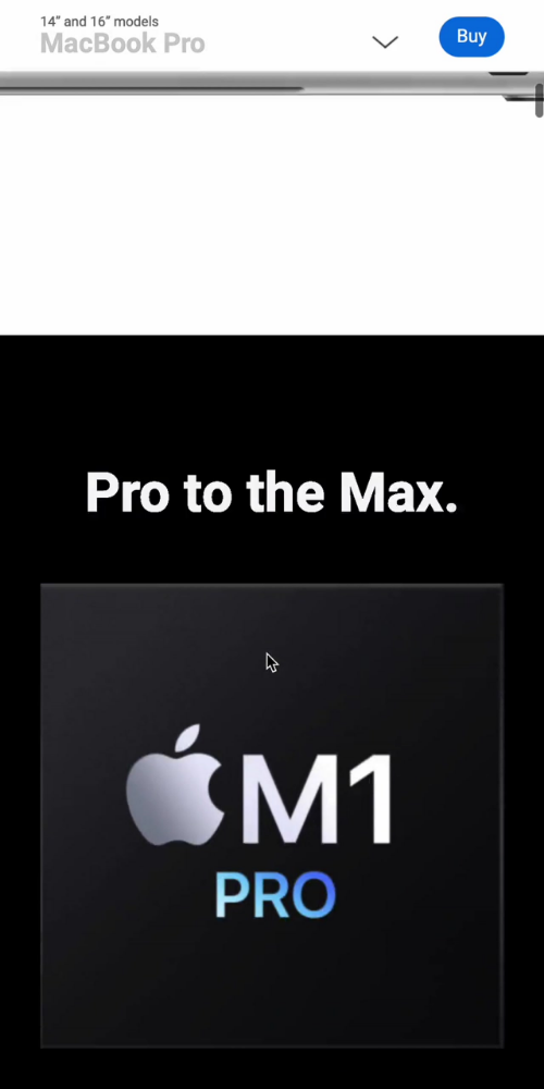
We replicated Apple's signature on-scroll animations, including product rotations, transitions, and interactive elements, bringing the pages to life and enhancing user engagement. This helped us learning how Apple's marketing people employ on-scroll animations and triggers to reveal content progressively, enhancing user engagement.
Adaptive Navigation & Layout
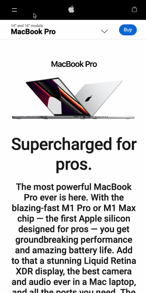
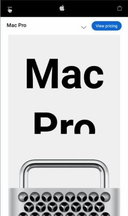
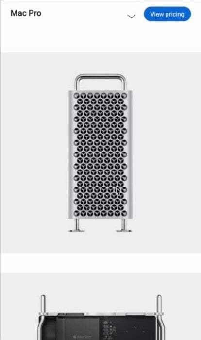
We dissected Apple's mobile-first approach, learning how to optimize layouts for various screen sizes and create intuitive navigation experiences across devices.
An important detail to note is the responsive navigation. Its implementation differs from simply stacking desktop elements to fit. Apple's approach to mobile responsive UI can be summarized as "prioritize content and adapt gracefully." They prioritize displaying the most crucial information first, adjusting layouts and elements seamlessly to fit various screen sizes.
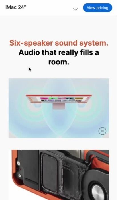
Implementation for mobile pages, like this one by Apple, often removes some of the desktop animations. The overall mobile experience aims for practicality and simplicity.
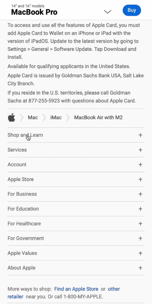
Another example of smart mobile responsiveness is using drop-downs to group links in the footer, instead of shrinking all elements (drop-downs aren't used in desktop for these links). All this to reinforce the importance of taking into account the user's context when designing for different platforms.
Practicing the Signature "Scroll-triggered Layered Reveal" Technique.
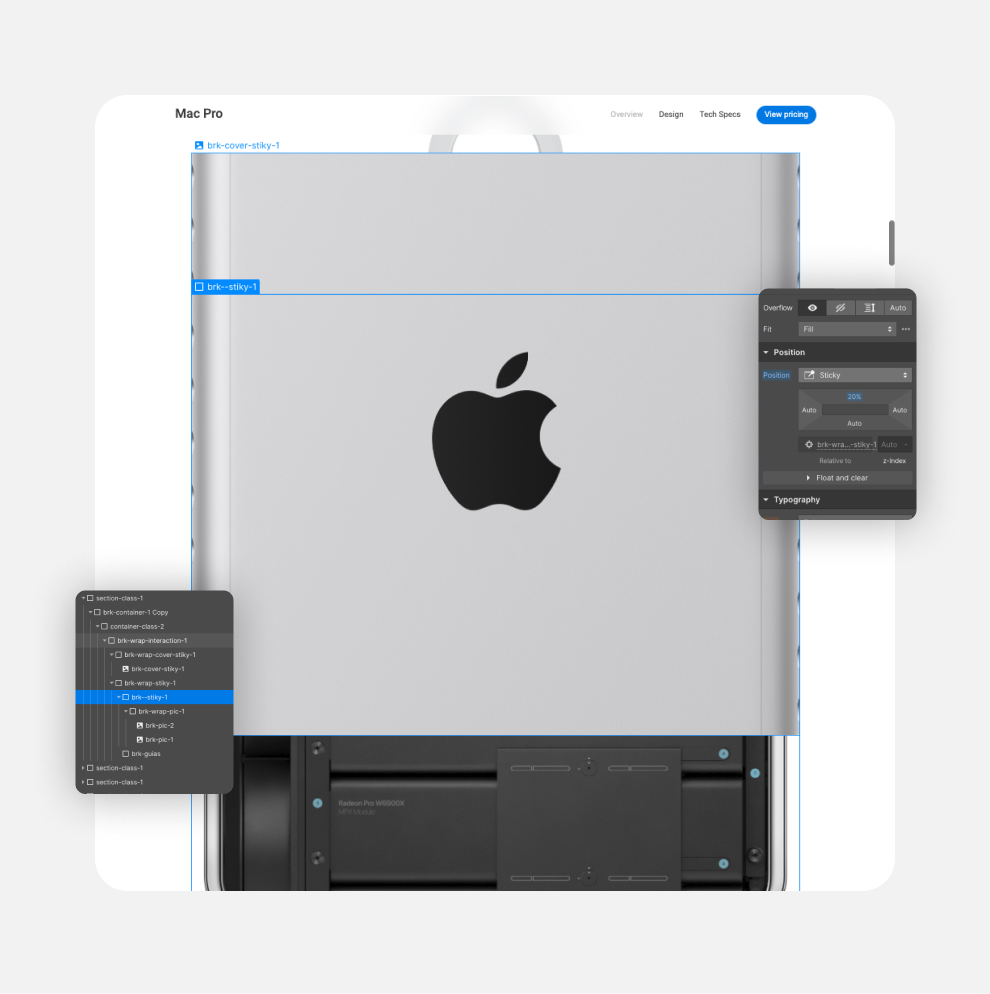
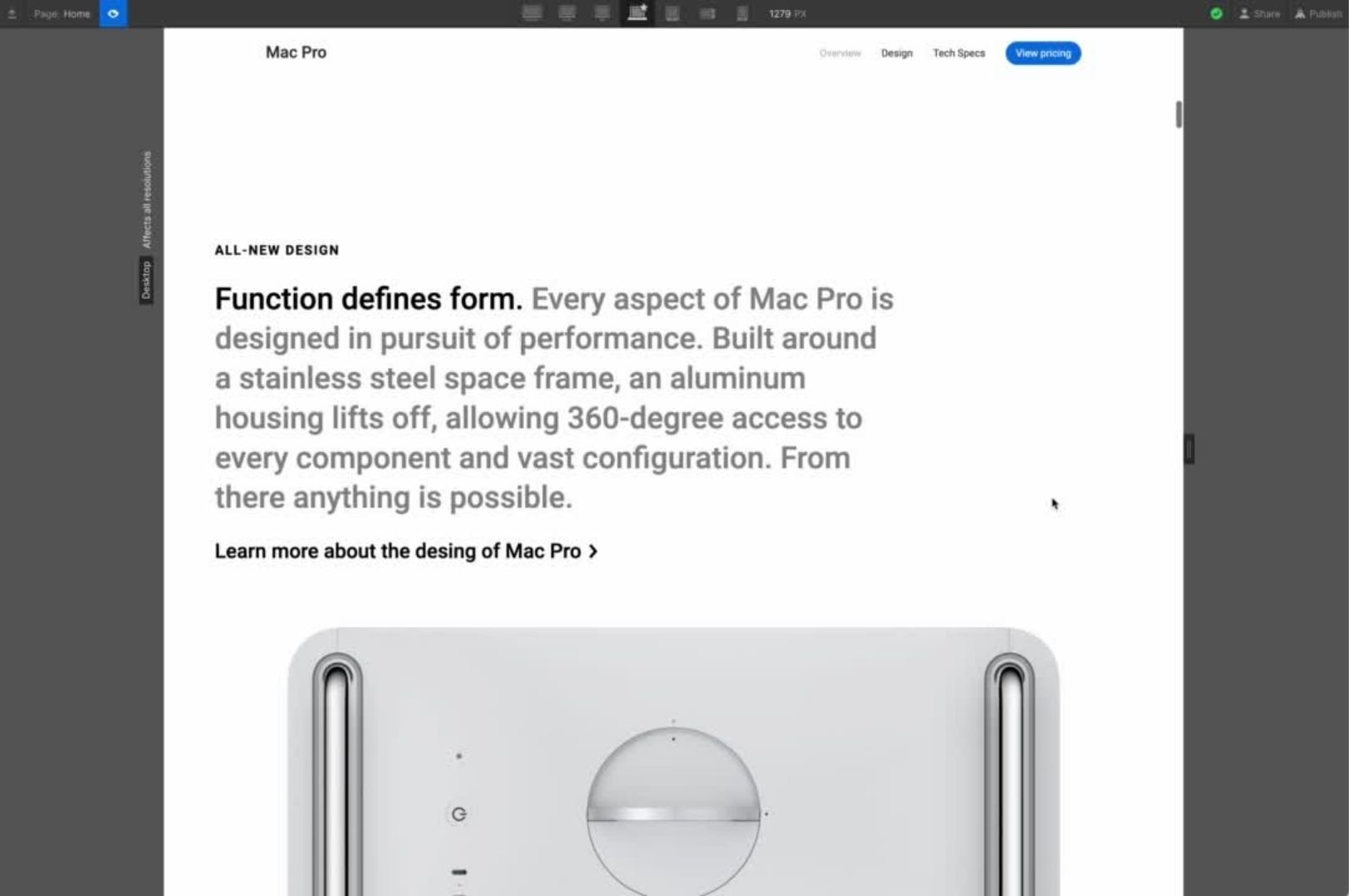
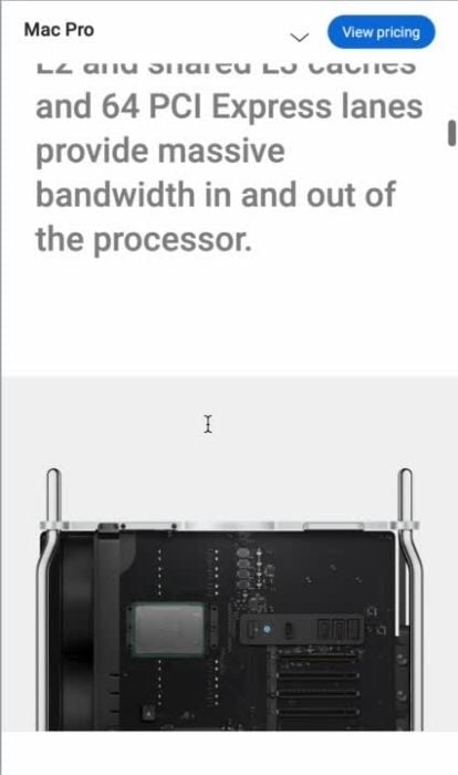
Across the different product pages, we recreated the hide text on scroll interaction ("Scroll-triggered Layered Reveal"). An instance of these animations, among many, can be found at the Mac Pro's top handle, serving as a visual anchor. As users scroll, the accompanying header text remains fixed or "sticky" on the screen, creating a focal point while the product image moves upward, further emphasizing the product's design and functionality.
Recreating signature "Peel-Away" animations.
One key signature interaction is that is used quite often in Apple landings, is that of the chassis opening sequence for the Mac Pro, where the exterior lifts while the internal components remain stationary, offering a captivating glimpse into the product's inner workings. This visually engaging animation adds a layer of interactivity and excitement, showcasing the product's unique features in a memorable way. "Peel-Away" animations create a sense of uncovering hidden content, like peeling away a layer.
Learning Apple's implementation for "Living Images".
These short, looping videos, seamlessly integrated within the webpage, could be described as "Dynamic Feature Vignettes" or "Animated Product Spotlights". They serve to breathe life into static product pages, offering a captivating glimpse into key features or functionalities in a way that static images or even lengthy descriptions cannot. Much like the moving pictures in the Daily Prophet from the Harry Potter universe, they add a touch of magic and dynamism to the otherwise flat page, drawing the user in and enhancing their engagement with the content.
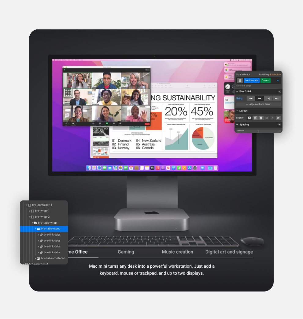
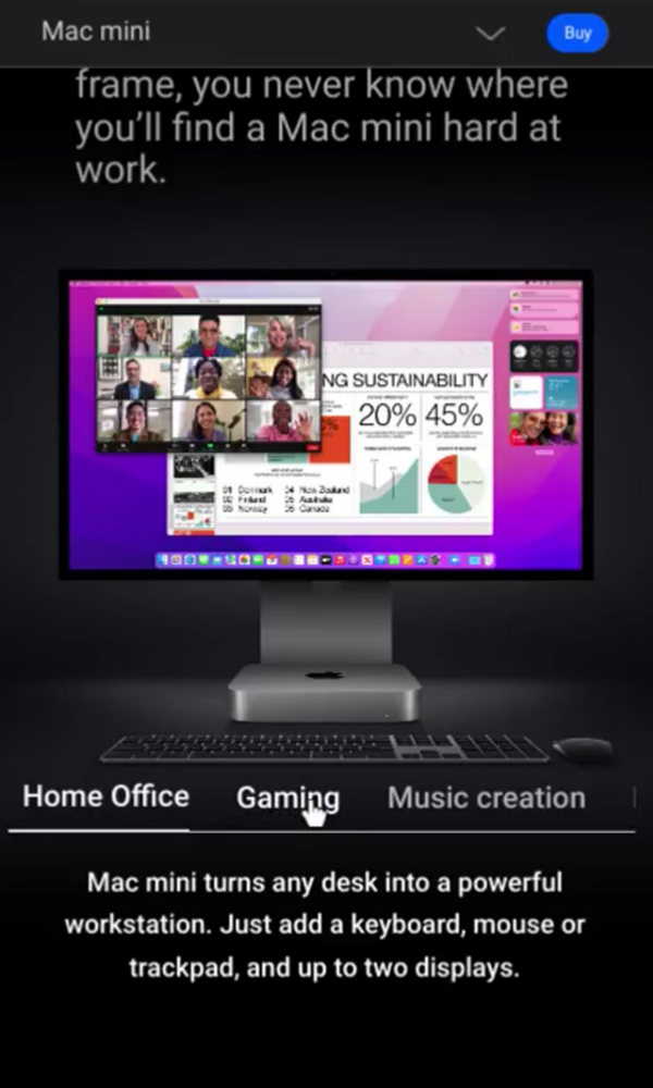
Identifying Apple's pattern for organizing information onto interactive tabs.
Webflow tabs functionality was used to recreate the clean and efficient way to organize and present information used by Apple, allowing users to easily navigate between different sections of content without overwhelming them. In the case of the Mac Pro page, for instance, we learned a pattern on using tabs to allow users to effortlessly switch between different Radeon graphic cards and see how they perform across various applications, making it easier to identify the best option for their specific needs. This user-centric approach aligns with Apple's design philosophy and enhances the overall product browsing experience.
Apple's mobile menus are exemplary in their simplicity and efficiency. They focus on prioritizing key navigation elements, using clear labels and icons to guide the user.
Apple identify and prioritize key tasks and features for each platform. The mobile experience should be streamlined and focused, presenting essential information and actions upfront.
We learned Apple takes into account the user's context when designing for different platforms. Mobile users may be on the go and have limited attention spans, so concise content are crucial.
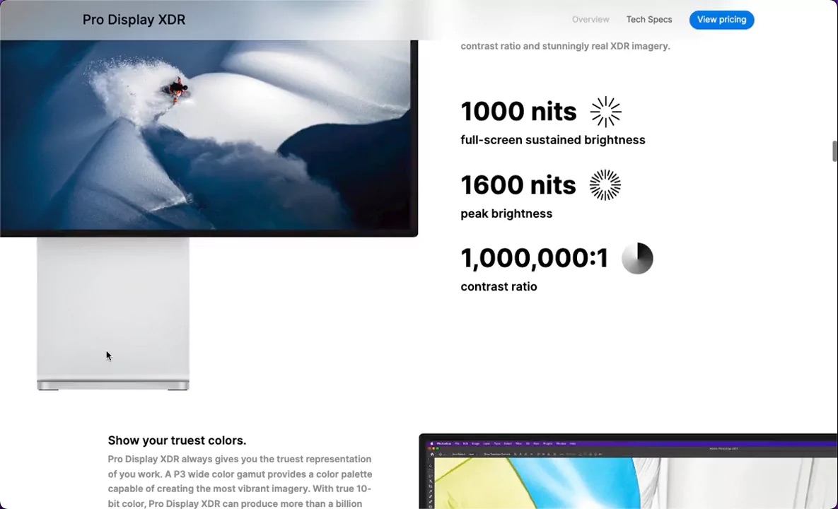
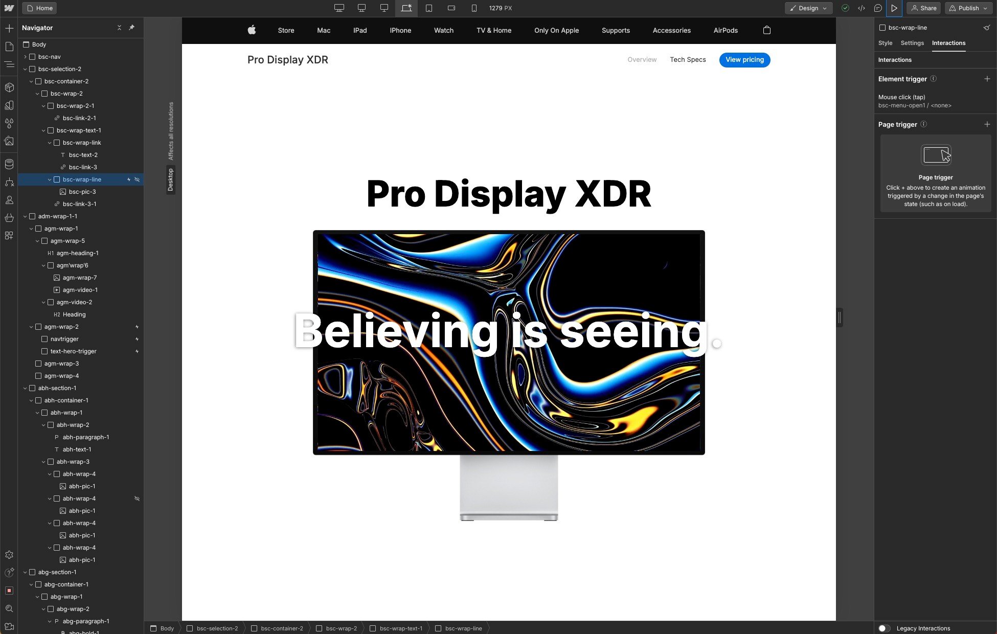
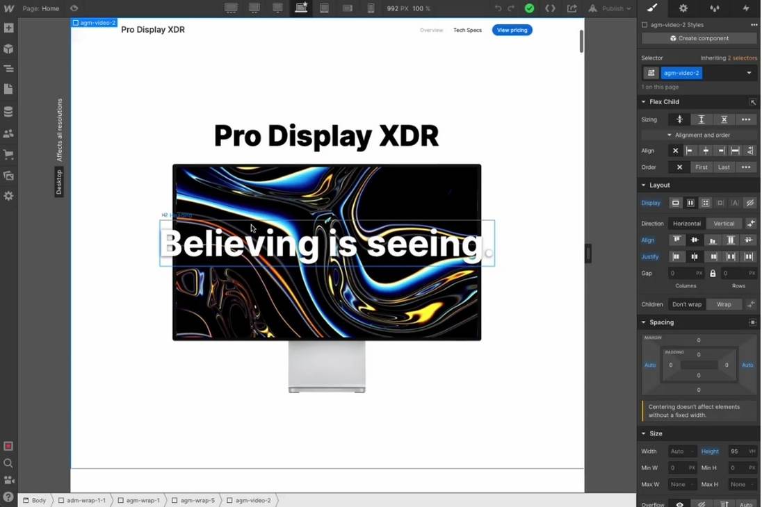
Overall, Apple landing pages (the Pro Display XDR being no exception) are masterclasses in showcasing a premium product through elegant design and strategic information architecture. As an example, the Apple Pro XDR Display landing page opens with a striking hero image of the display, immediately capturing the user's attention. A concise headline and supporting text introduce the product's key features and benefits, creating a strong first impression. All of which we were able to build on Webflow.
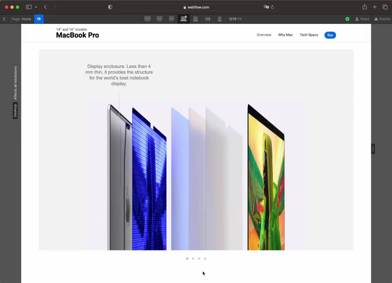
Studying the Apple Signature "Fullscreen to Framed Reveal".
One type of interaction we often rebuilt was the "Fullscreen to Framed Reveal" or also "Sticky Zoom-Out Video". The video initially occupies the full screen, providing an immersive experience. As the user scrolls, it gracefully shrinks and integrates into the page's layout, creating a sense of continuity and visual interest.This technique not only showcases the product or feature dynamically but also serves as a visual anchor, guiding the user's attention and encouraging further exploration of the page.
Going Deep into Their Approach to Space and Focus.
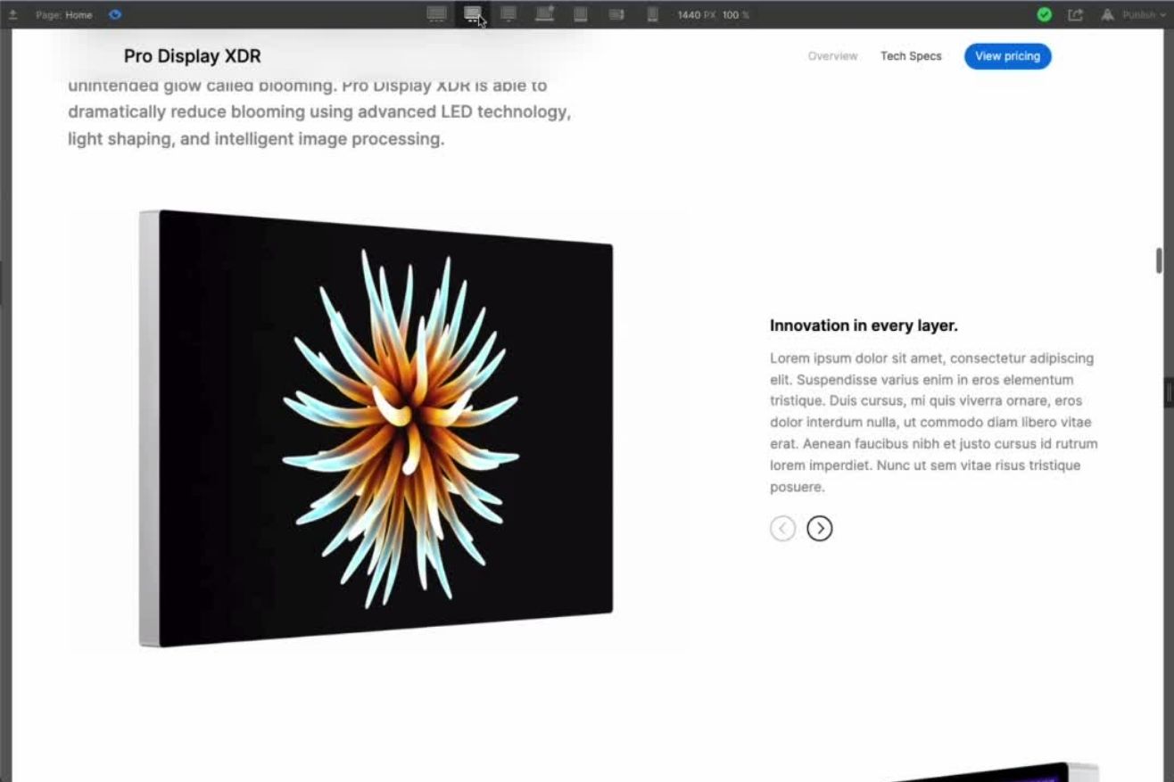
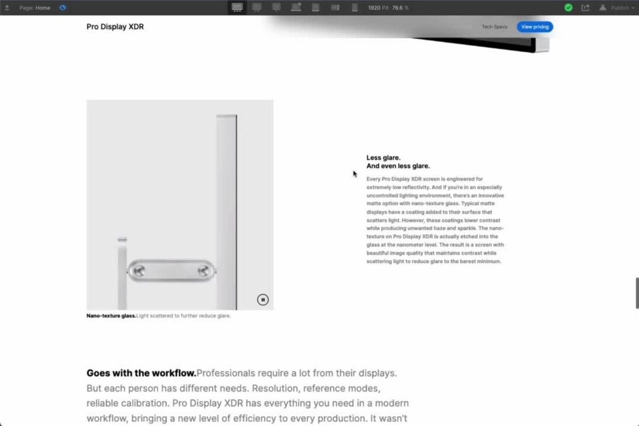
Apple pages employs a clean and minimalist design, with ample white space and a focus on high-quality product imagery. Desktop layouts can accommodate lots of content and complexity, but still maintain a clear hierarchy.
Such a minimalist approach allows their products to take center stage and emphasizes its sleek design.
Identifying Apple's Patterns of Feature-Focused Content Sections.
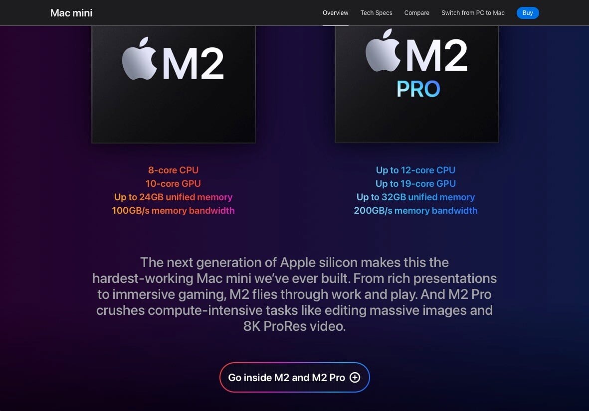
Pages' content is organized into distinct sections, each dedicated to highlighting a specific feature or benefit of their products. This modularity in use of blocks or boxes creates visual order and facilitates easy scanning of information, allowing users to quickly locate features of interest.
Learning that Subtlety Can Impact.
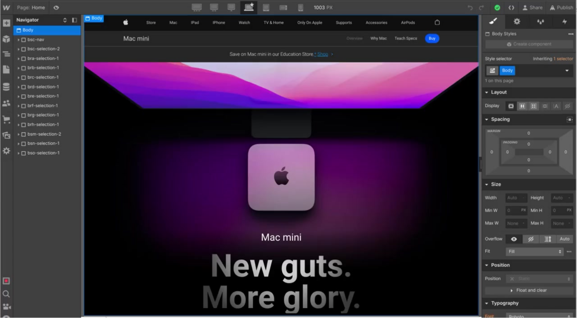
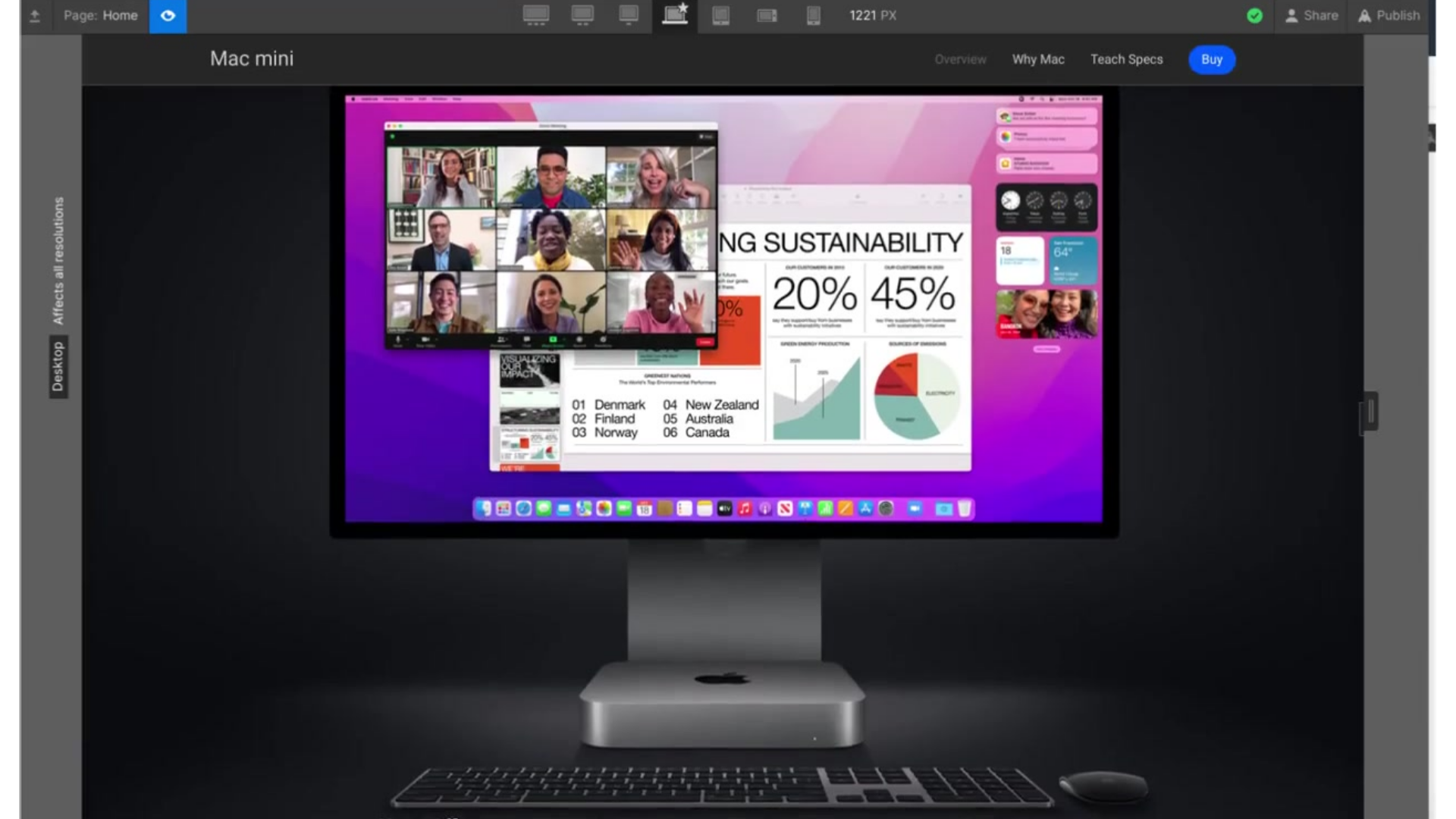
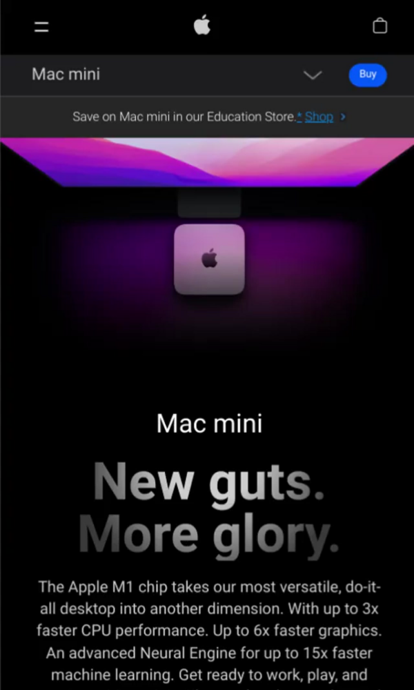
Simplicity can be just as impactful, if not more so, than complex animations. Apple's Mac Mini hero section demonstrates the power of clean design and focused messaging. A key takeaway: Subtle animations or transitions can add dynamism without distracting from the core message.
Spotting the Importance of Visual Appeal for Visual Storytelling.
Apple utilizes a combination of high-resolution images, product videos, and interactive animations to tell their products story. And their high-quality product imagery and videos take center stage, not only emphasizing the product's design and aesthetics but aiding the storytelling.
Identifying the Use of Progressive Disclosure.
Using popups effectively delivers in-depth information without cluttering the main page, enhancing user experience by keeping the core message clear and concise. Apple tends to use this approach to reduce complexity in large content areas.
Studying the Use of Interactive Tabs by Apple.
Tabs offer a layer of interactivity, allowing users to delve deeper into specific details at their own pace. They allow Apple to showcase a wealth of product details in a user-friendly and visually appealing manner.
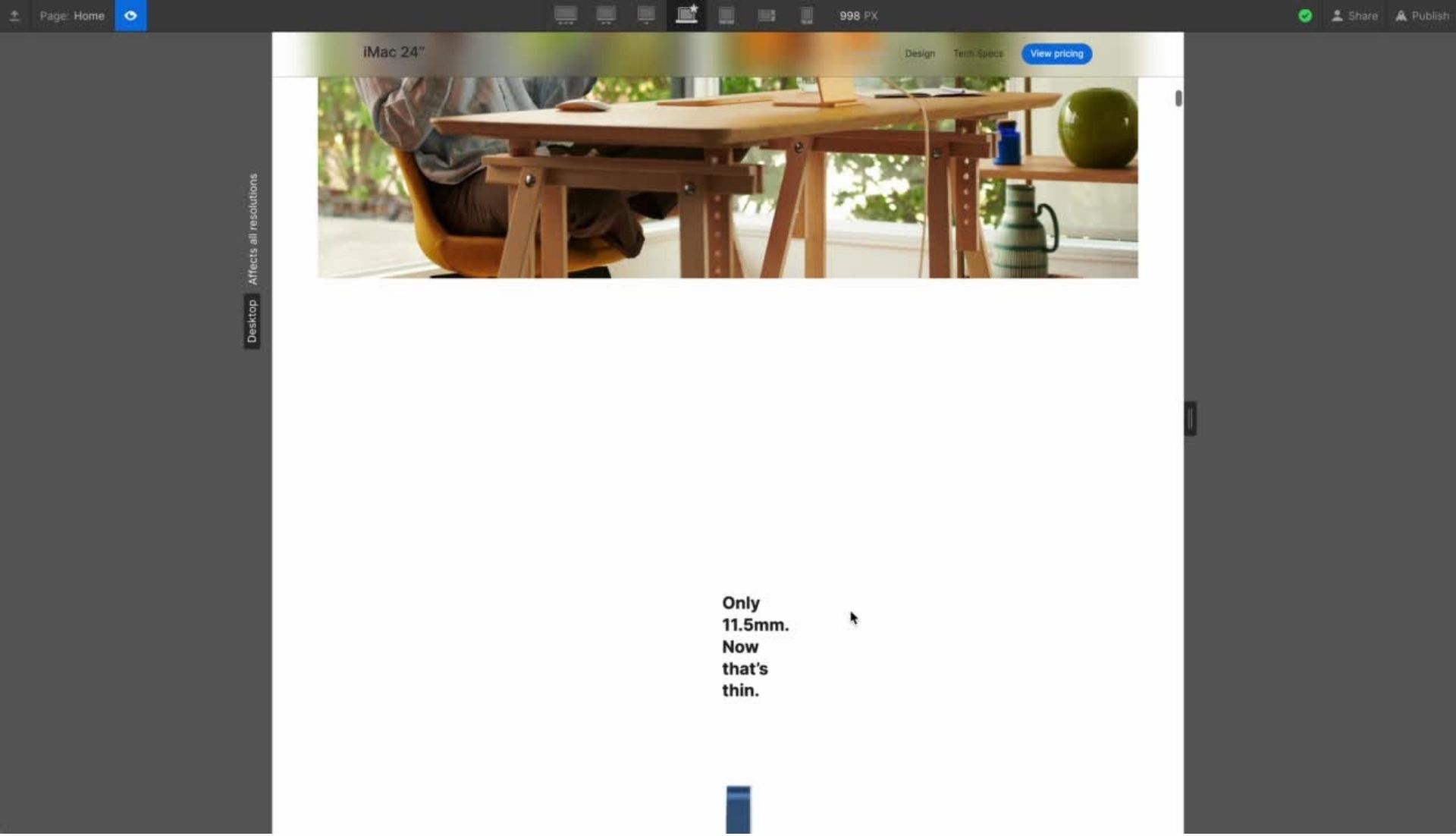
Identifying the Apple Signature "Dramatic Entry" or "Heroic Impact" on Scroll.
This concept encapsulates the idea of creating a powerful impression through bold visuals, captivating animations, and impactful messaging. Apple goes with this approach to grab the user's attention immediately and sets the tone for the rest of the experience. A good example of this narrative is seen in the iMac landing page when users start scrolling from the hero section to the "Only 11.5mm..." dramatic animation.
It all starts with the user's initial scroll, where high-quality product visuals dominate, creating interest and emphasizing product aesthetics. Minimal text focuses on a concise headline and key benefits, highlighting the product's essence without overwhelming users.
And then... an impressive on-scroll animation HITS, revealing additional information and details in an engaging way, making for the above mentioned Apple signature "Heroic Impact".
Understanding How Apple is Creating Space.
Strategic use of white space prevents visual clutter and maintains focus on key elements. Apple is renowned for its masterful use of whitespace, which creates a sense of elegance, clarity, and focus. Their product landing pages generously employ white space to achieve a minimalist aesthetic, allowing the products themselves to shine.
And Finally, Doing it All While Keeping Consistency.
While adapting to different screen sizes and interaction patterns, maintaining a consistent visual language and design elements across platforms is noticeable across all pages, allowing for a sense of familiarity and cohesion.
Conclusions
By studying and implementing these techniques, we have learned how to create Apple-style captivating and informative web experiences that resonate with users and effectively showcase our clients' products or services. Apple's signature web design approach involves a seamless blend of interactive elements and visual storytelling. It includes sticky headers for persistent navigation, layered animations for revealing content progressively, and dynamic video showcases for engaging product demonstrations. They prioritize clear, concise communication with minimalist hero sections and streamlined mobile menus. Furthermore, Apple strategically uses tabs to organize information and maintains cross-platform consistency for a unified user experience. This thoughtful combination of techniques results in highly impactful and user-centric web experiences that showcase products with elegance and innovation.
.jpg)
.jpg)
.jpg)
.jpg)
.jpg)


.jpg)
.jpg)


.gif)
.gif)
.gif)

